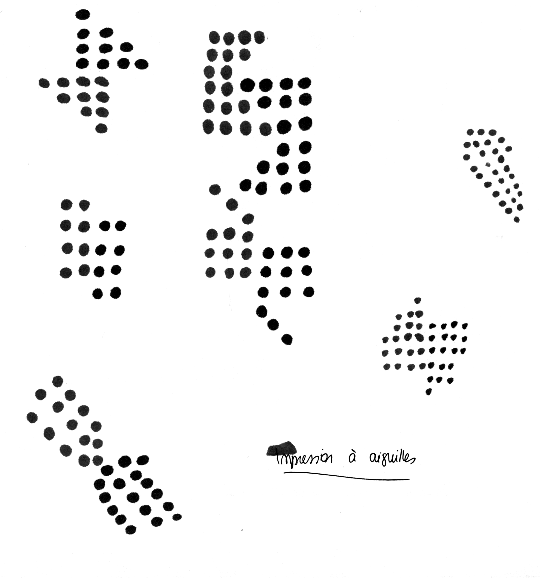

Creation of a dingbats typography inspired by Matrix font by Zuzanna Licko, which was made for dot-matrix printers and the first Macintosh, in the 1980's. The font Dots that I designed is based on the principles of weft and matrix.
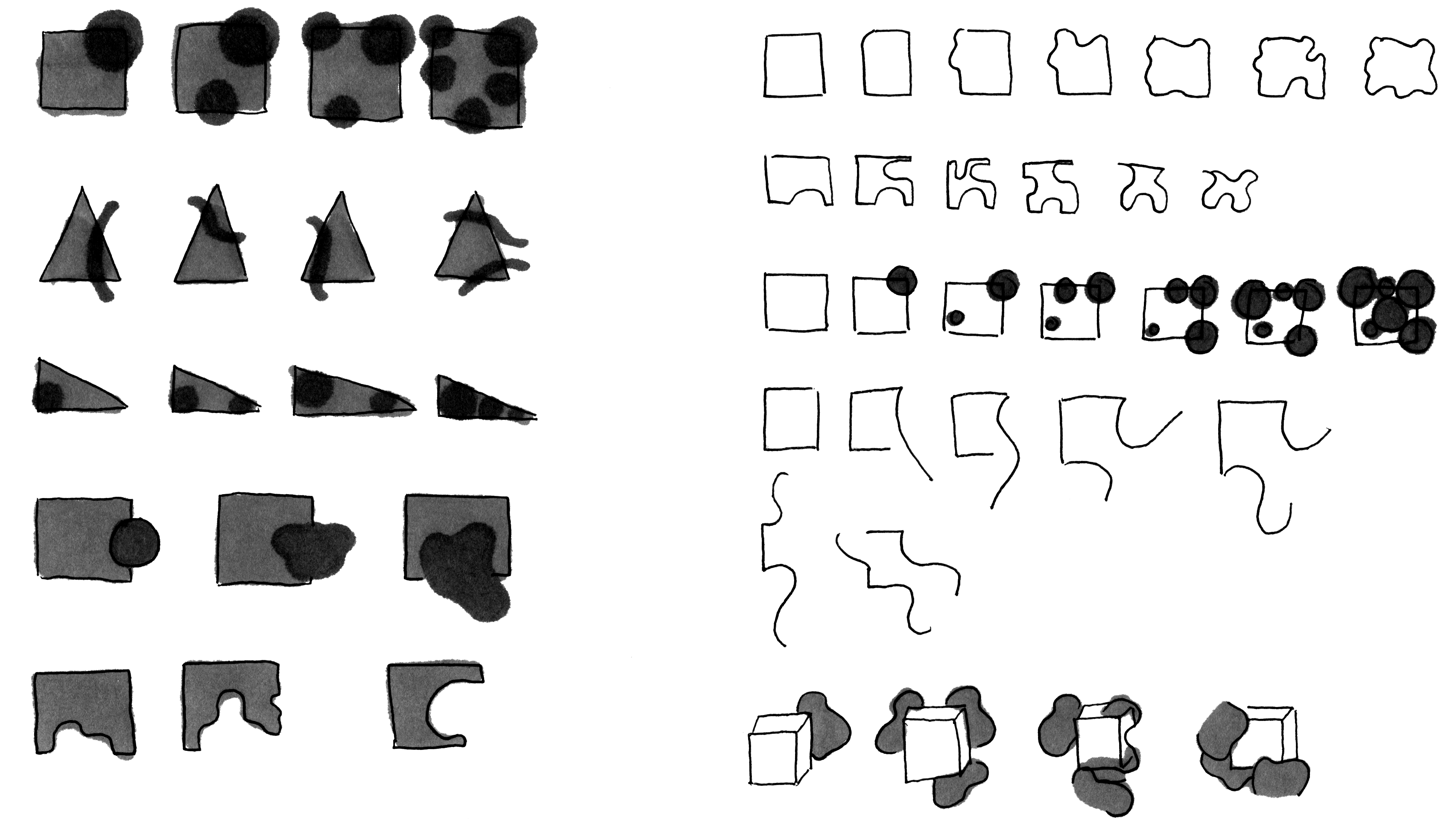
Zuzana Licko's Matrix was made to make the printing of typefaces easier with matrix printers. The letters are made of several small dots and have to be simplified to avoid overloading the computer.
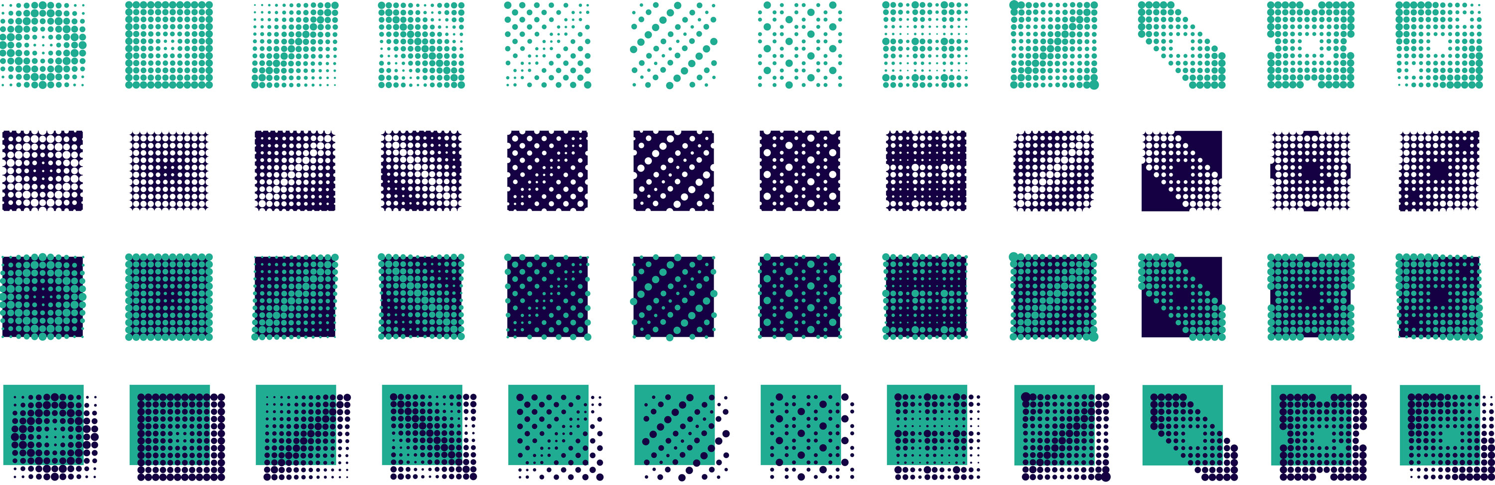
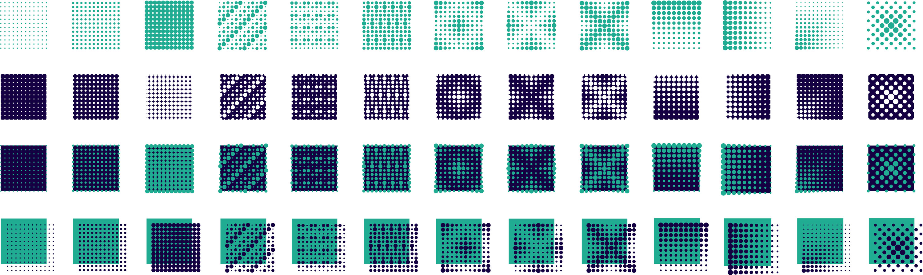
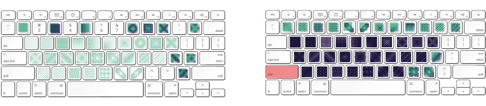
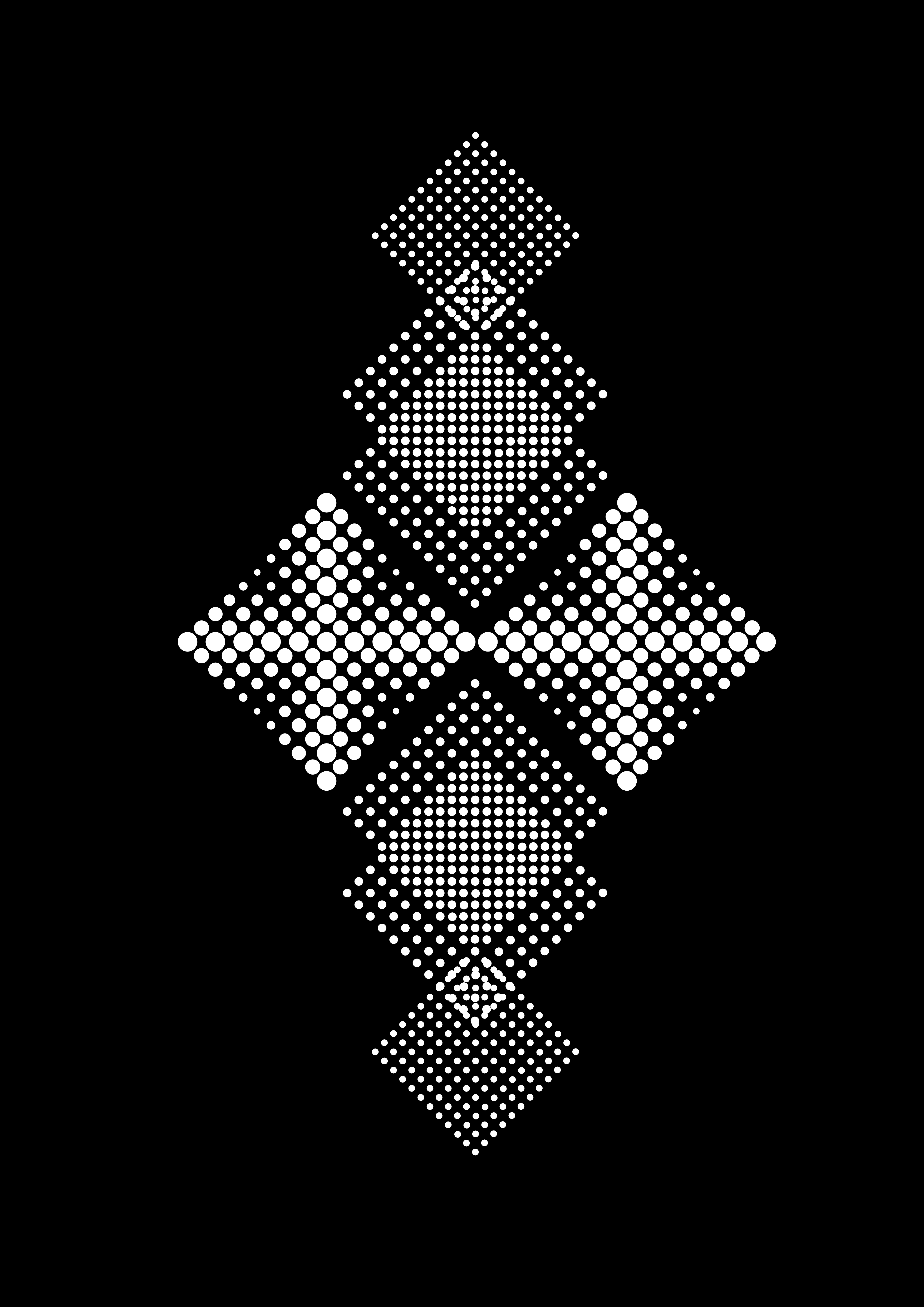
My typeface "Dots" is a reinterpretation of Matrix which represents a zoom into the matrix. The typeface is divided into four families that question the aesthetics of this simple matrix. Finaly, I made an editorial object to present the typeface and I printed some posters with the screen-printing technique.
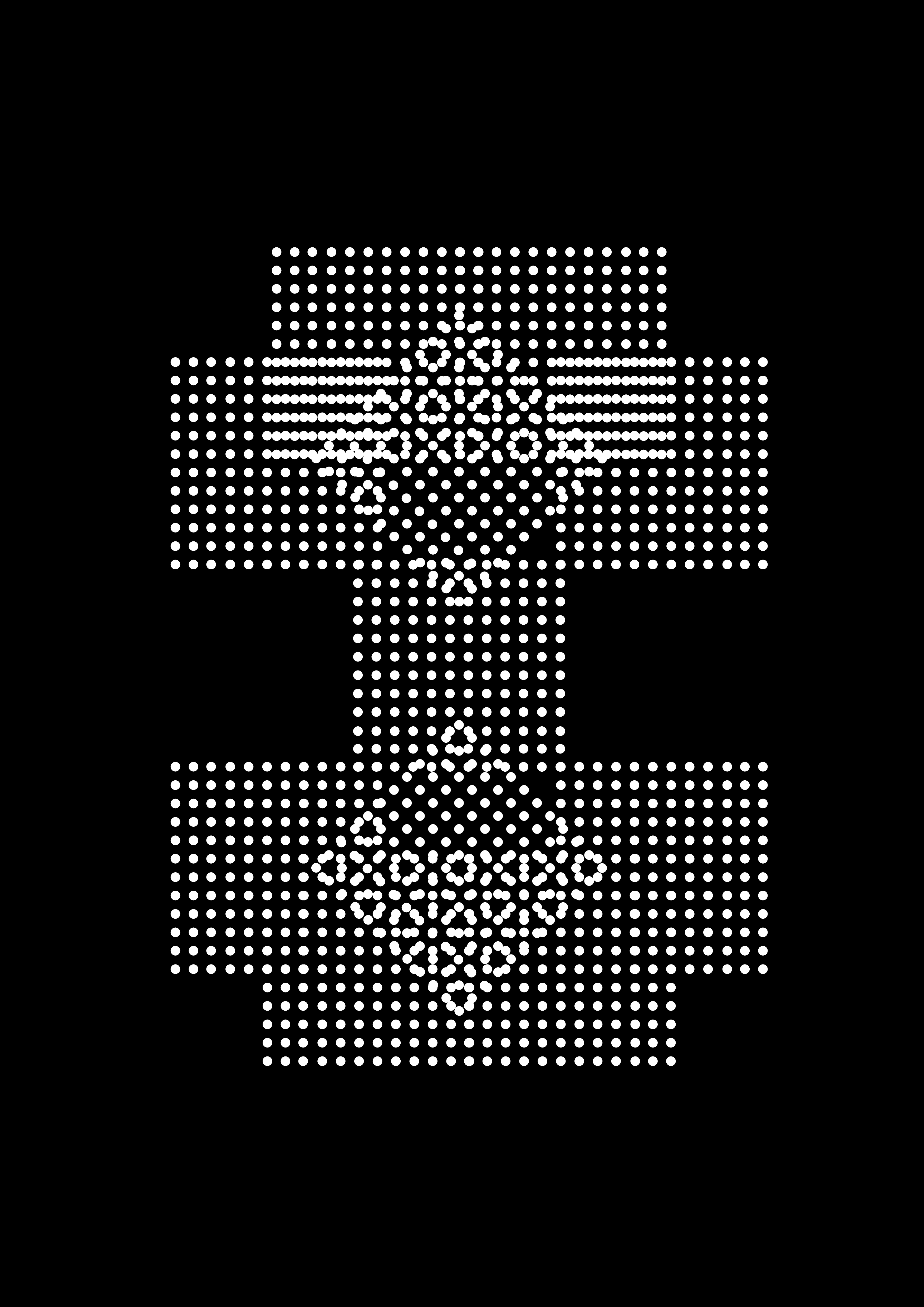
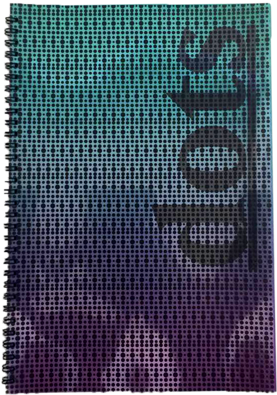
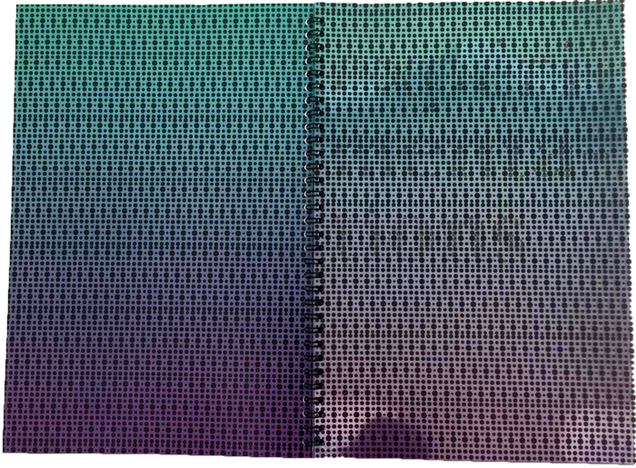
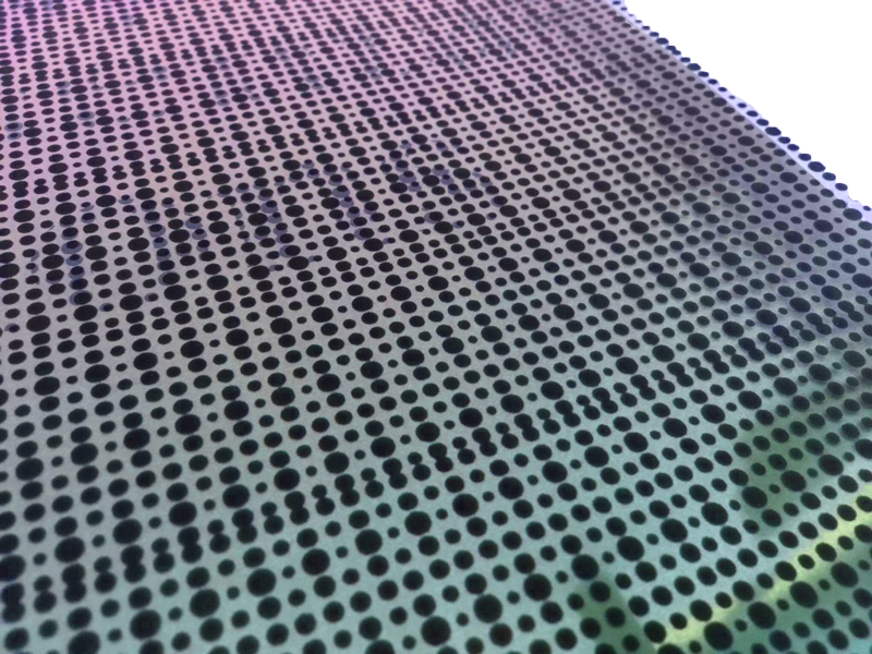
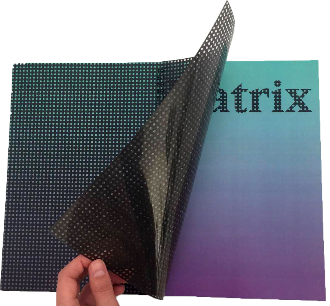
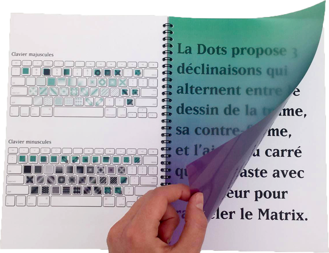
Typographic specimen - 30 pages edition Presentation of the typeface's principles and aesthetic such as the creation of patterns when the caracters are juxtaposed, superimposed, rotated... These patterns can be used for textile, wallpaper or to divide chapters in a book. I printed them on rhodoid to hide and uncover the titles and to evoke the principle of matrix.
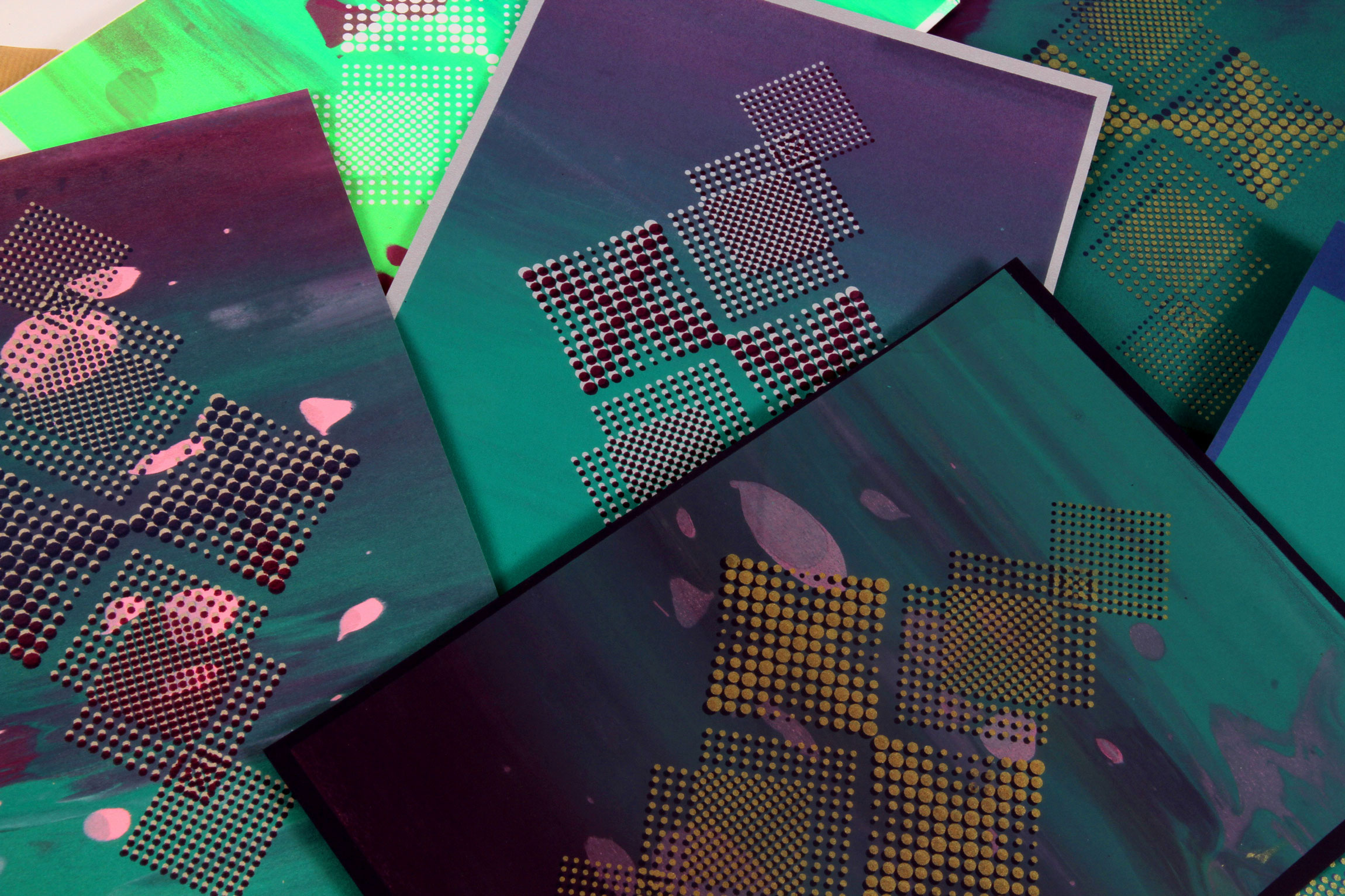
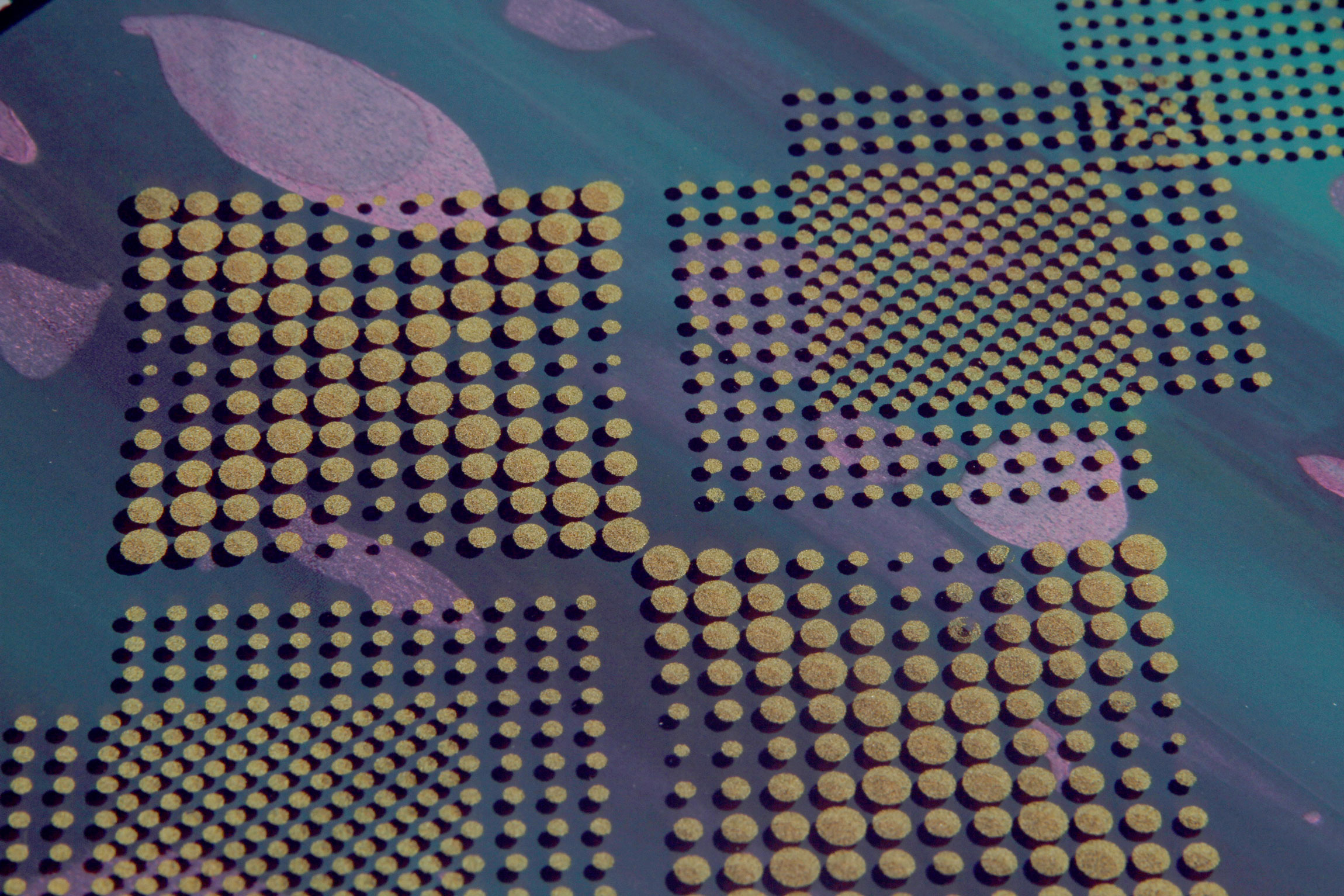
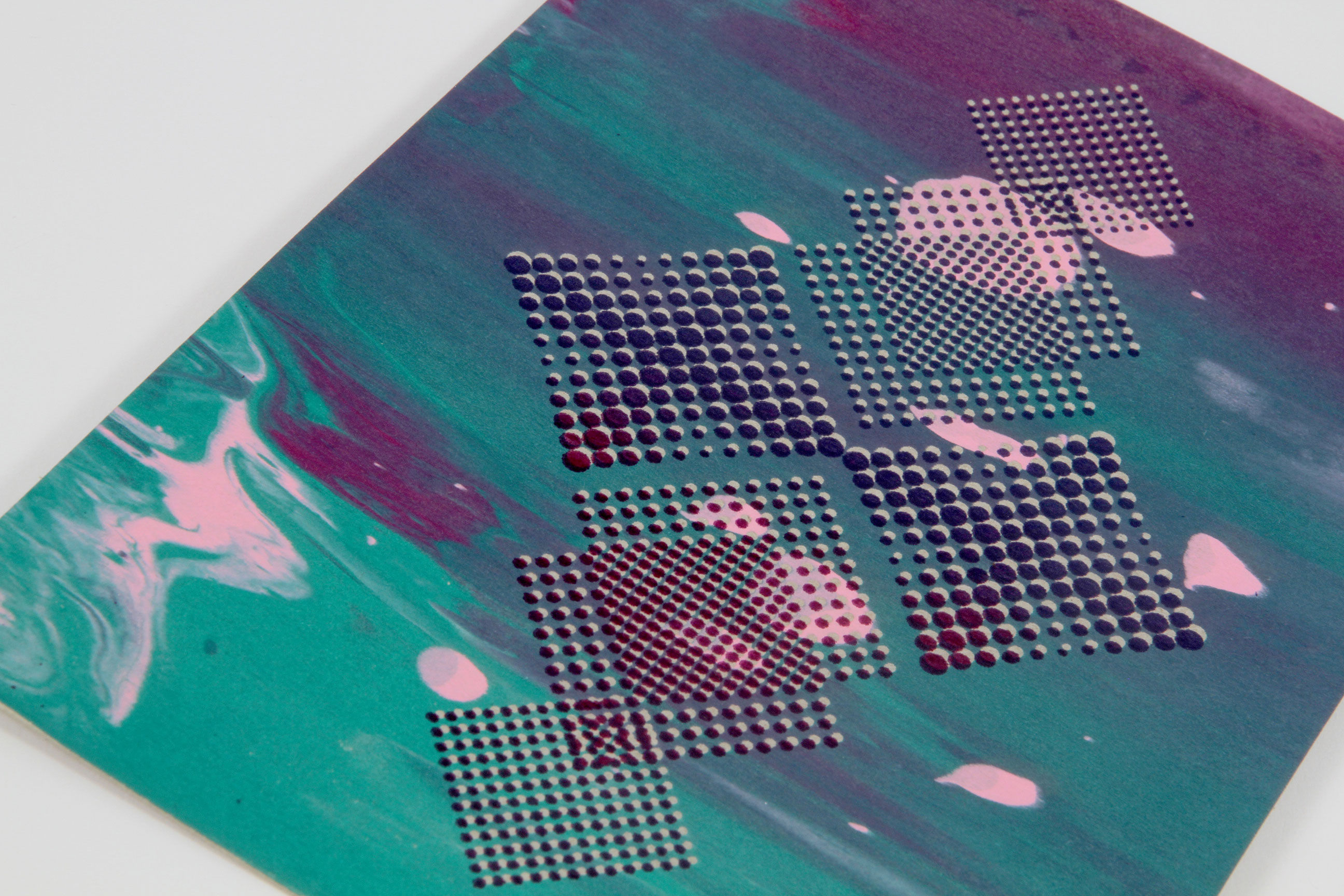
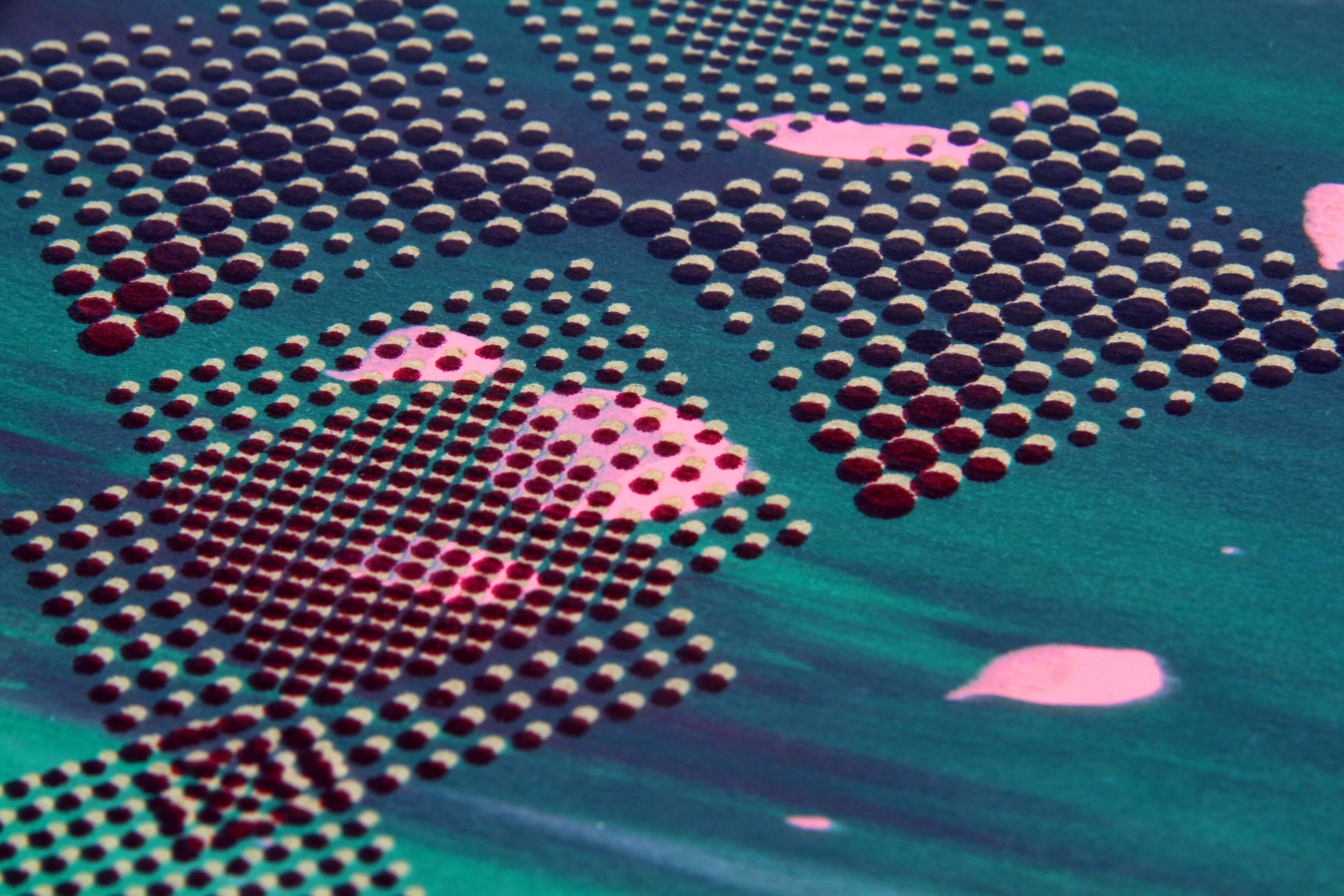
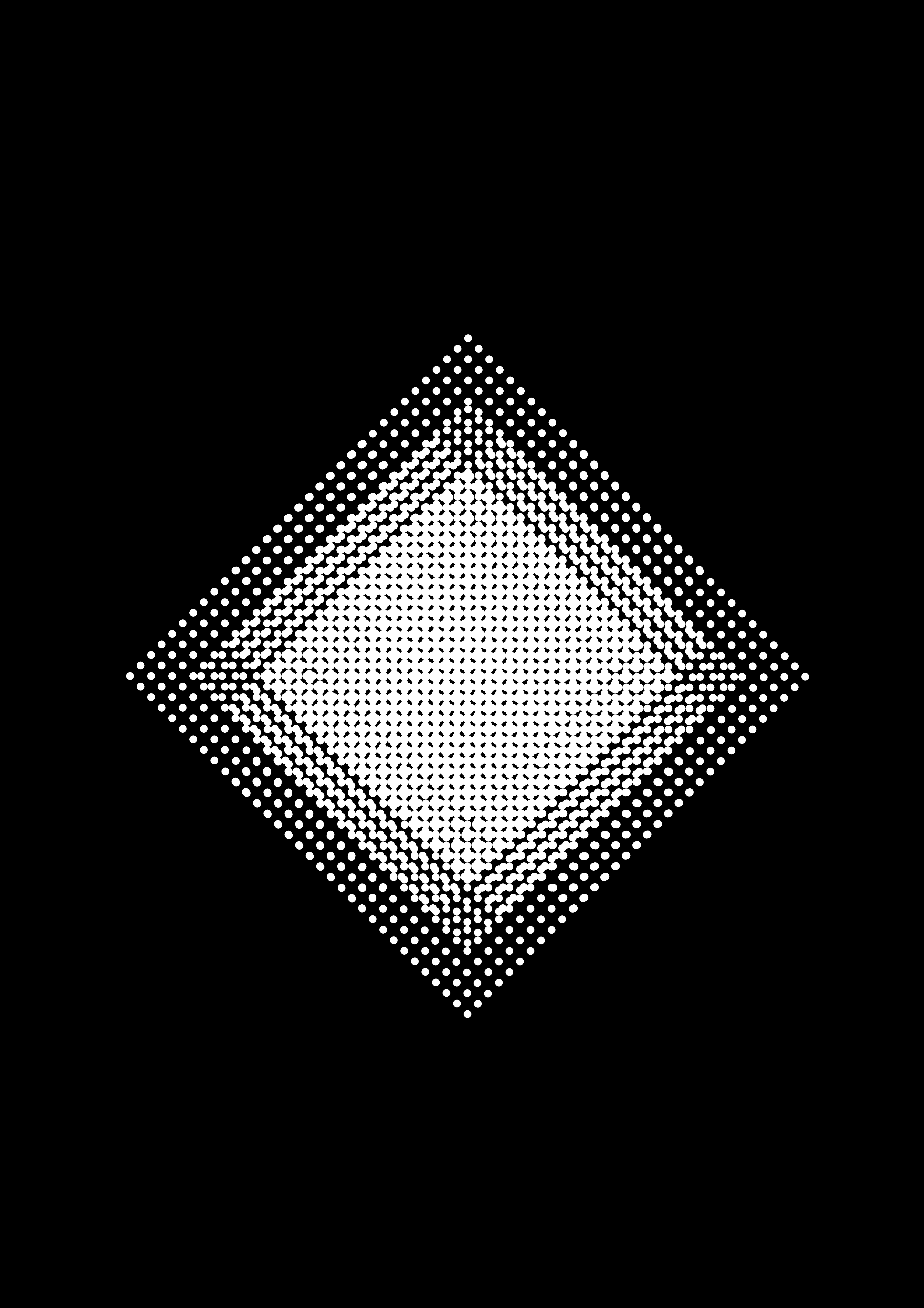
Screen-printed posters - A4
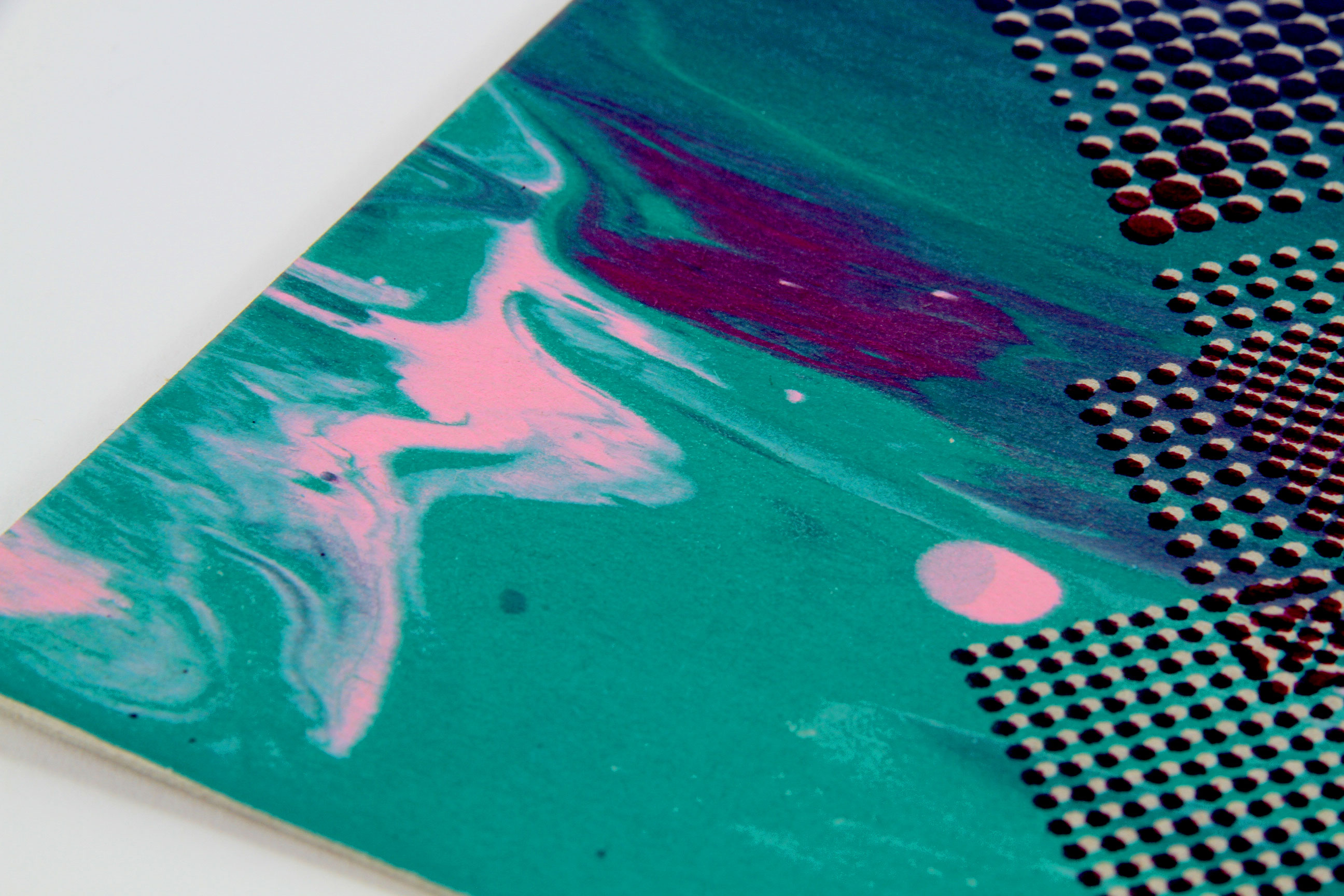
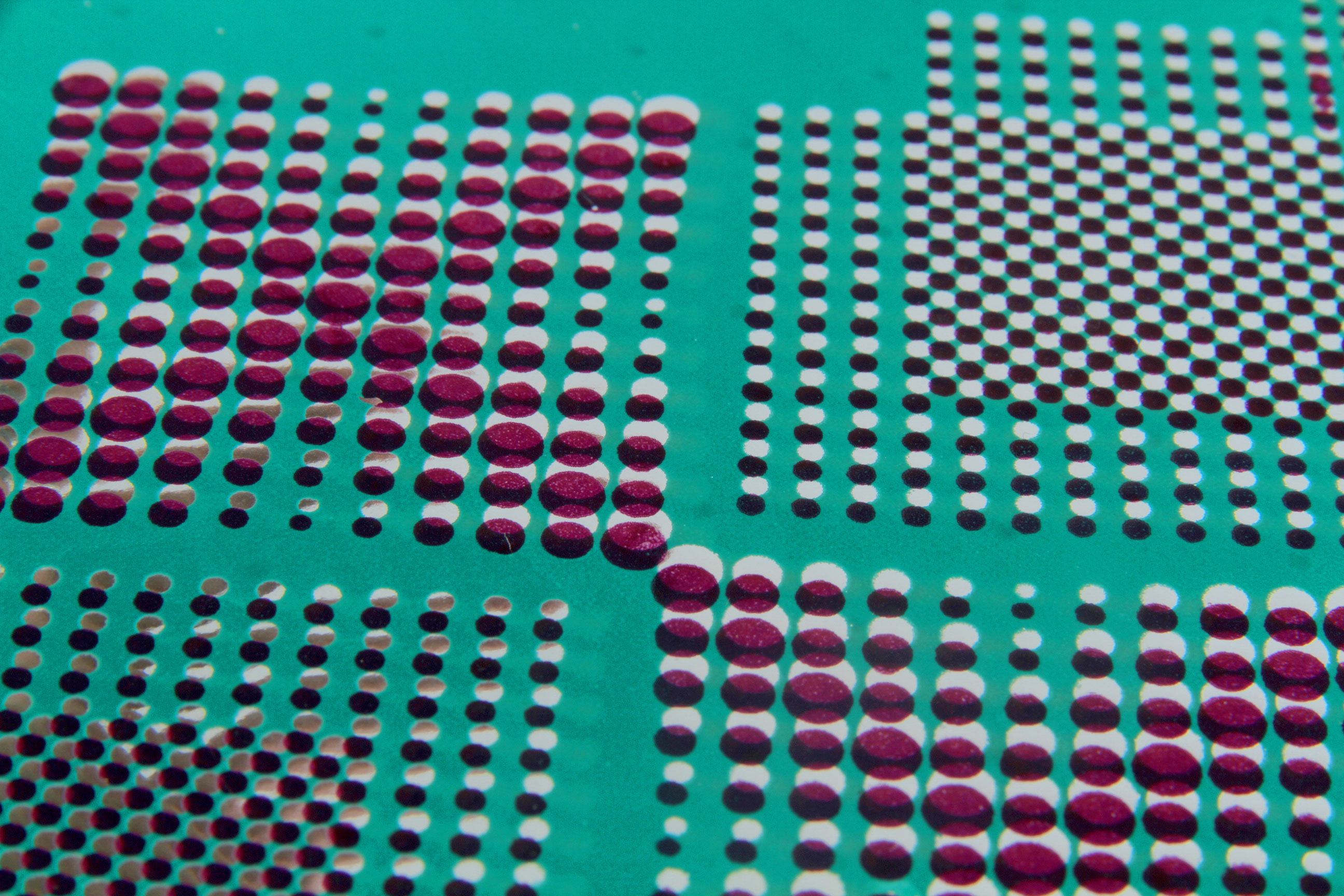
A series of screen-printed posters on different papers. This technique provides color gradients and marble effects. I used two masks and shifted them to create relief and optical effects.